Android runs on a variety of devices that offer different screen sizes and densities. For applications, the Android system provides a consistent development environment across devices and handles most of the work to adjust each application's user interface to the screen on which it is displayed. There are 4 key terms you should remember. They are,
1. Screen Size:
Actual physical size, measured as the screen's diagonal.
For simplicity, Android groups all actual screen sizes into four generalized sizes: small, normal, large, and extra large. The actual to general mapping is shown below,
xlarge screens are at least 960dp x 720dp
large screens are at least 640dp x 480dp
normal screens are at least 470dp x 320dp
small screens are at least 426dp x 320dp
2. Pixels Per Inch(PPI) or Dots Per Inch(DPI):
The quantity of pixels within a physical area of the screen
For simplicity, Android groups all actual screen densities into four generalized densities: low, medium, high, and extra high. The actual to general mapping is shown below,
3. Density Independent Pixels(DP):
A virtual pixel unit that you should use when defining UI layout, to express layout dimensions or position in a density-independent way.
Calculation: px = dp * (dpi/160).
Let's for example take Google Nexus 5 & Google Nexus 4. According to
DPI love , Google Nexus 5 has 445dpi and Google Nexus 4 has 318dpi. Now when the developer defines a view to be having a width of 40 dp , the corresponding pixels will be px5 = 40 * (445/160) = 111 for Google Nexus 5 and px4 = 40 * (318/160) = 80. So you can see that , the view is optimized according to the specific screen using a simple logic. Without this approach, directly mentioning the size using px or cm will give a inconsistent view across multiple screens as shown below.
Best Practices:
1. The following is a list of resource directories in an application that provides different layout designs for different screen sizes and different bitmap drawables for medium, high, and extra high density screens.
res/layout/my_layout.xml // layout for normal screen size ("default")
res/layout-small/my_layout.xml // layout for small screen size
res/layout-large/my_layout.xml // layout for large screen size
res/layout-xlarge/my_layout.xml // layout for extra large screen size
res/layout-xlarge-land/my_layout.xml // layout for extra large in landscape orientation
res/drawable-mdpi/my_icon.png // bitmap for medium density
res/drawable-hdpi/my_icon.png // bitmap for high density
res/drawable-xhdpi/my_icon.png // bitmap for extra high density
2. Always design the screen with a mobile or tablet in mind. Specifically, when selecting resources based on the size qualifiers, the system will use resources designed for a screen smaller than the current screen if there are no resources that better match (for example, a large-size screen will use normal-size screen resources if necessary). However, if the only available resources are larger than the current screen, the system will not use them and your application will crash if no other resources match the device configuration (for example, if all layout resources are tagged with the xlarge qualifier, but the device is a normal-size screen).
3. To create alternative bitmap drawables for different densities, you should follow the 3:4:6:8 scaling ratio between the four generalized densities. For example, if you have a bitmap drawable that's 48x48 pixels for medium-density screen (the size for a launcher icon), all the different sizes should be:
36x36 for low-density
48x48 for medium-density
72x72 for high-density
96x96 for extra high-density
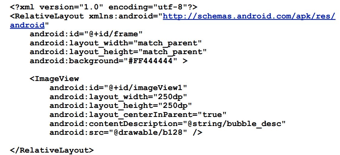
4. Use wrap_content, fill_parent, or dp units when specifying dimensions in an XML layout file
5. Do not use hard coded pixel values in your application code
6. Do not use AbsoluteLayout (it's deprecated)
7. Supply alternative bitmap drawables for different screen densities


